Times change, users are constantly on the go, shopping from their mobile devices more often than ever before. This forces online businesses that crave to be competitive and successful to redesign their stores to fit the expectations of their buyers and to opt for modern solutions.
Be it the choice of building a progressive web application instead of getting a native application or simply giving their site a new more mobile-optimized look, no development team will go far without proper designs.
On this page, we’ll introduce you to 5 trends in UX and UI, give tips, and provide examples of how the “big brands” are already doing it.
1. Enhanced Product Galleries
Opening the list is perhaps one of the main elements of eCommerce product pages, the image gallery. Pictures are very powerful when it comes to the display of the sold product. They need to be taken professionally, show the item from various angles, providing the main details up close.
Importantly, all the used pictures must be optimized in terms of their weight and have proper Alt tags and naming. This is necessary so as to not slow down the page load times and make the images be beneficial SEO-wise too.
As of recent, the galleries on most top-notch online retail stores take up a larger and larger percentage of the page. Some galleries are completed by videos, 3D product rotations, and zoom functionality.
Mentioning a non-standard gallery layout that looks classy, take a look at the screenshots taken on a product page on the official Burberry website. Designers have opted for a split gallery solution, placing the images in non-slider format. They’ve taken a different path, and instead of choosing to display the photos in a carousel or some other habitual pattern, the gallery pictures break the page text sections. Did you notice how large the photos of the product are? Plus, upon a click on any image, the gallery opens in a pop-up and allows to list through the pictures in a slider.
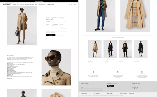
Screenshot taken on the official Burberry website
2. Neat Product Reviews
Customer feedback on products is highly important in eCommerce. Clients usually spend a lot of time going over the comments of others, reading about their buying experience and opinions on the purchased items when making up their mind about the item’s quality.
Most online stores have standard layouts of review sections that are headed with an overview that summarizes all the feedback and gives ratings on this or that product. Such sections then show specific comments and data on the customer who left it, sometimes specifying their age, where they’re from, etc.
Yet apart from the more or less habitual reviews layouts, designers are experimenting with new arrangements of such data blocks. A neat example of this is the “Reviews Are In” section on the official MAC Cosmetics website. As you can see, the top client reviews on the Ruby Woo lipstick have been placed in a stylish grid. Apart from the quotes with feedback, we can see an image of the product and the submitted client photos of the customers wearing the product as well as a button that can take users to the section with the rest of the reviews.

Screenshot taken on the official MAC Cosmetics website
3. Product Builders
The next modern UX\UI trend for eCommerce sites deals with product customization functionality. Numerous stores and brands have developed and integrated solutions that give users the opportunity to play around with the given designs of the sold items. That said, clients are provided with the chance to create their own looks of a product and order the item in the way they’ve fashioned it to their taste.
From the perspective of design, it is vital to do everything possible to help the user to visualize what the final product will look like. Furthermore, every changeable detail has to be divided into tabs or steps to simplify the process.
In my point of view, the designers who created the Nike By You product builder that’s available on the official Nike site have done an outstanding job. This advanced item customizer has a 3D rotation effect that twists and twirls the shoes, showing them from the best angles and perspective as the user creates their own design.
When moving from tab to tab, the changed detail of the shoe is presented very clearly and is even highlighted for several seconds. The options that the client can select are also very transparent and immediately change on the shoes when chosen. This all makes it easy to navigate the product constructor tool and to build the custom design of the item.
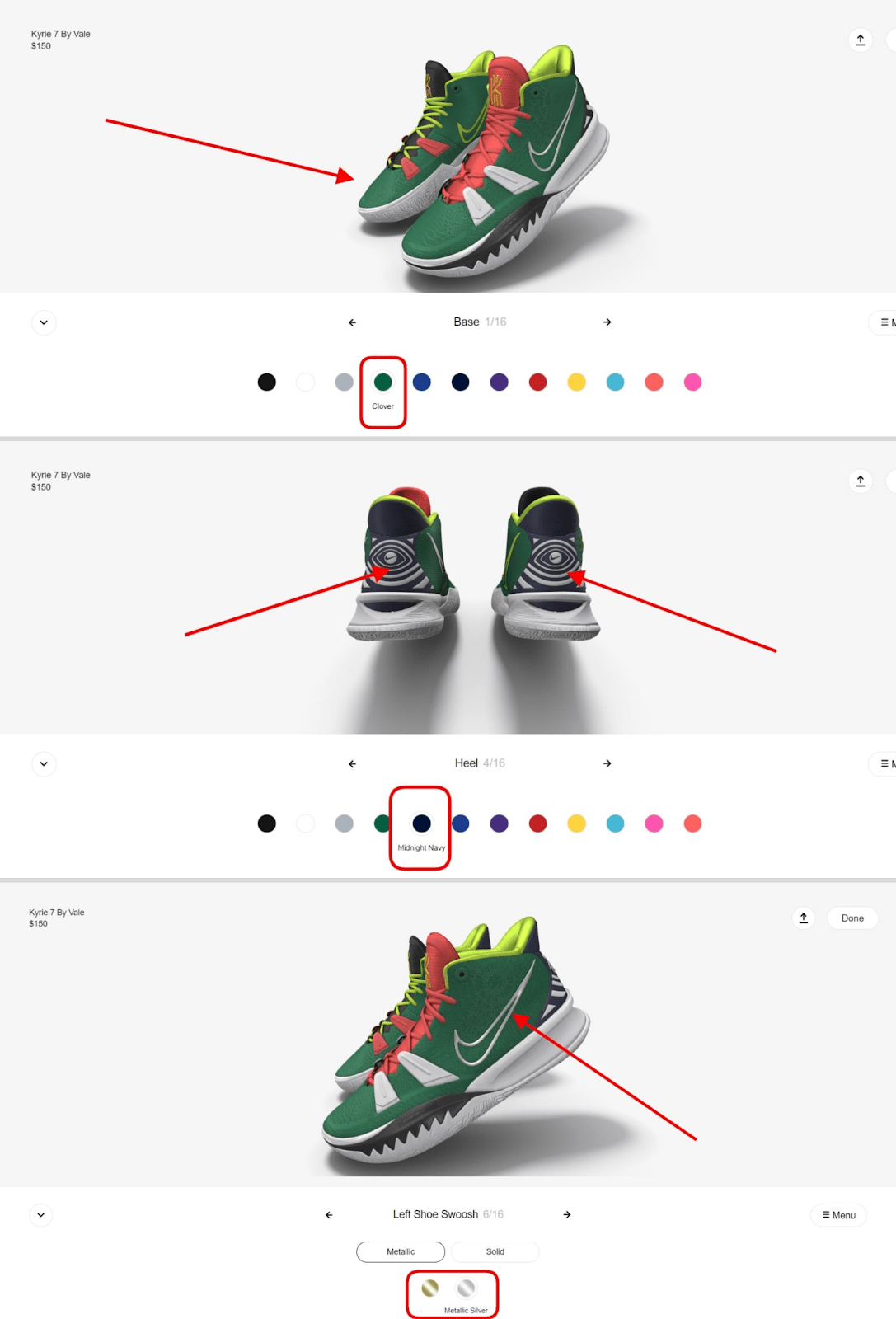
Screenshot taken on the official Nike website
4. Tutorial Blocks & Visualization
When a sold product requires an explanation of some sort, it’s up to the designers to find a way to walk the customer through the process. Be it a tutorial or simple “how-to”, it’s much better to show how things work than to explain it with words. Of course, the use of videos isn’t always the best “move”.
Based on the specifics of the product, the options here are endless. The design solutions that I’d like to bring up in this section of the article are the ones available on the official Maybelline New York website. There are two unique blocks that deserve attention on the Brow Ultra Slim product page.
First, let’s overview the multi-step carousel that shows how to apply the two-sided product. As you can see, the process is broken down into just three steps. We see three photos and short descriptions that change their positioning when the user clicks on the left or right arrow. This way, the side pictures take the position of the central one with the text changed correspondingly. The block is quite fancy although it may seem simple.
The block right below it is another interesting design decision. Because the product comes in multiple shades and can be applied in different ways, the sliding divider that’s placed atop the picture can show the “before-after” look when moved from side to side. Such a presentation of the product can sway away many doubts and clearly show the user what the product can look like on them.
This idea is also a wonderful alternative for the enhanced “try it on” functionality that’s very popular among eCommerce sites. Its advantage over virtual try on lies in the simplicity of the solution that doesn’t require turning on the user’s camera.
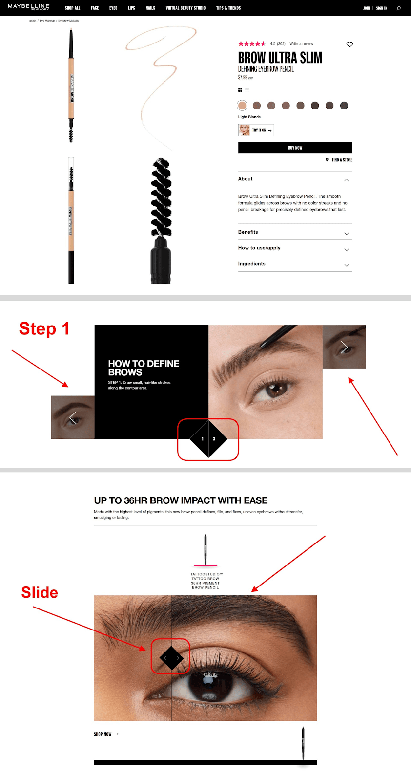
Screenshot taken on the official Maybelline New York website
5. The Store Checkout
The fifth final point on the agenda deals with the product checkout. Did you know that according to Baymard almost 70% of the shopping carts are abandoned? This means that almost three-quarters of the users leave online stores without buying anything. And one of the reasons for that are inconvenient product checkouts.
The major thing here that designers and store owners have to bear in mind is that people hate wasting their time. Heavy and lengthy checkouts that are over jammed with too many fields of the form to fill out often disappoint users (especially if it’s their first time trying to finalize an order in the store). As a result, people leave the page not wishing to spend half an hour on the process.
Moreover, security is also an essential part of any checkout so, if the website
checkout is not HTTPS enabled then, there are chances of customers to move
away from the website. Strong security is a sure indicator to win customers
confidence. Also, they feel confident about their personally identifiable
information. To get the best SSL certificate, an e-commerce store can consider
a multi-domain wildcard to secure multiple domains and their subdomains.
Different options are available in the market that provides SSL certificates at a
discounted price with the same level of security.
That said, it is essential to rethink the design and concept of the checkout to help more users convert into clients. Minimize and simplify. These are the two main things to give consideration to when working on the checkout design.
Below is a nice example of the checkout on the official Calvin Klein website. On the right, there’s a clear overview block that gives a summary of the items that are being checked out. The price is broken down and there’s even a photo of the product. Moreover, the main area consists of just the necessary fields, many having a dropdown or picklist. Nothing excessive and very convenient.
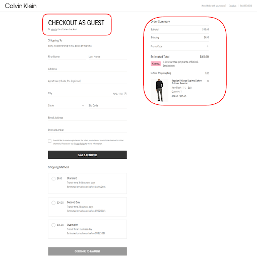
Screenshot taken on the official Calvin Klein website
To Sum Up
Concluding everything mentioned in this article, UX\UI in eCommerce in 2021 is moving towards change. Designers are tweaking habitual layouts and opting for better solutions that users expect to see. With a better understanding of the client and business needs, the enhanced mobile-optimized designs and re-worked page sections can help to convert more customers and grow revenues.


